Airbnb Interior Design Ideas (2026): Minimal, Durable, Photo-Ready
Minimal Airbnb interior ideas for high-turnover rentals — intentional palettes, layered lighting, durable neutrals, and styling that reads on phones and in professional photography.

The Problem This Guide Solves
Vacation rental owners who over-decorate or under-decorate both end up with the same problem: spaces that feel chaotic or sterile in photos, fail to stand out in search, and don't communicate the guest experience they promise.
Key Takeaways
- Minimal doesn't mean white and boring — a pop of color goes a long way in neutral rooms
- The 60-30-10 rule creates balanced, professional-looking color schemes without design training
- Durable furniture in neutral colors is easier to maintain and accessorize over time
- Lighting quality (dimmers, layered sources) dramatically impacts how a space photographs and feels
- Avoid design sets — mixing and matching creates depth while staying minimal
Minimalism that survives 50+ turnovers a year
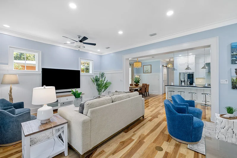
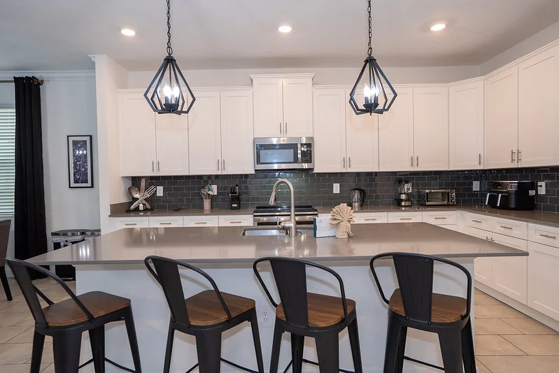
True minimal STR design is intentional restraint: fewer, better pieces with commercial textiles and forgiving finishes. Avoid trendy ultra-gloss surfaces that show dust in photos; favor matte ceramics, textured wovens, and performance rugs under dining zones. Layer lighting: cans for tasks, pendants for character, lamps for warmth — phone cameras lift dramatically when multiple sources balance shadows.
Art should be large enough to read on wide-angle shots; a wall of small frames reads as clutter on Airbnb thumbnails. Choose one accent hue and repeat it in three places per room (pillow, art stroke, ottoman stitch) for cohesion without theme-park kitsch.
The comfort of your guests is paramount in your Airbnb interior design — and the minimalist approach, when executed correctly, delivers that comfort without the visual noise that makes spaces feel chaotic in photos. Below are the key principles that create maximum impact for every guest.
Step-by-Step Furnishing Strategy
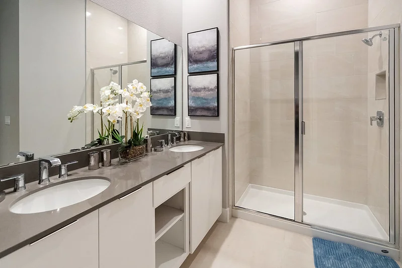
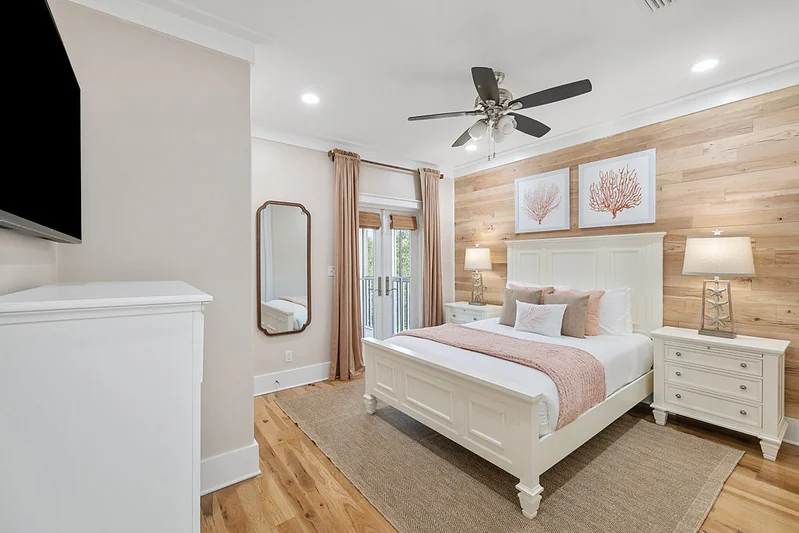
Choose minimal, not boring
Minimal design is about intention, not absence of personality. Avoid painting every wall white and choosing furniture with no color or detail — white becomes dull quickly and is a turn-off for guests who've seen it in dozens of average listings. A pop of color on pillows or wall art is subtle, won't look garish, and gives guests something memorable to photograph.
Invest in durable, neutral furniture
High-quality, durable furniture in neutral colors makes it easy to accessorize and evolve your décor over time. Instead of buying matching sets, mix and match pieces to create a dynamic, layered look — this is the hallmark of a minimal aesthetic that photographs professionally. Neutral furniture also allows you to refresh the space by changing accent items without replacing core pieces.
Apply the 60-30-10 rule
This classic interior design principle: 60% dominant color (walls, rugs, major upholstery), 30% secondary (floors, accent walls — slightly richer tone), 10% accent (pillows, blankets, art — most vibrant). Following this ratio creates inherent visual balance even without formal design training. It's the fastest way to make a room look intentional and professional in listing photos.
Use lighting strategically
Lighting makes a huge impact on any space — and on how your property photographs. Install dimmers wherever possible: they give guests control and create a flexible atmosphere. Layer lighting sources: overhead (for function), floor/table lamps (for ambiance), and accent lighting (for focal points). Simple, sleek fixtures add to the design without competing with it.
Select only what is needed in each space
In living rooms: a roomy sofa, comfortable chairs, a spacious coffee table, a media console. In bedrooms: solid bed frame, dresser, nightstands, lamps. Everything should have a purpose. Clutter — extra chairs, redundant tables, too many decorative items — photographs as chaos rather than character. Design for your maximum occupancy's functional needs, then stop.
Common Mistakes to Avoid
- Choosing all-white everything to look 'minimal' — this photographs as sterile, not sophisticated
- Over-decorating with mismatched accent items that clutter rather than complement the core design
- Under-lighting bedrooms and living areas — poor lighting makes even quality furniture look cheap in photos
- Buying matching sets that create a hotel-generic look instead of a distinctive identity
Related Furnishing Guides
Eight Core Services
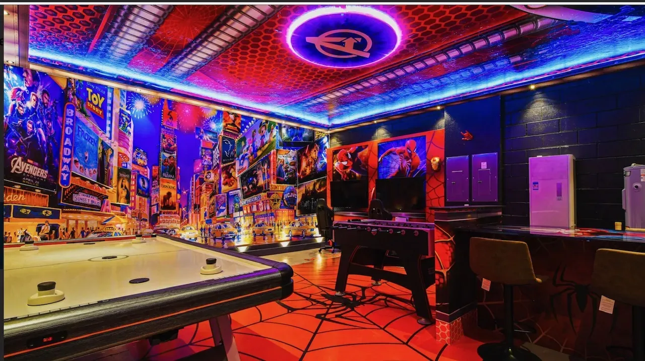
Turnkey to Themed Rooms — All Under One Roof
Full furniture packages, STR interior design, themed kids suites, game room conversions, property prep, custom bunks, white-glove install, and listing-ready staging — for vacation rentals and second homes across Orlando, Kissimmee, Davenport, and the full Florida STR market.
Frequently Asked Questions
What colors work best for Airbnb interior design?
Warm neutrals (off-white, warm gray, soft beige, natural linen) are the most consistently successful base palette for vacation rentals. They photograph well in all lighting conditions, appeal to the broadest range of guests, and make it easy to add or change accent colors without repainting. Layer in one or two accent colors (warm tones like terracotta, sage, or navy perform well in Florida markets) using pillows, rugs, and art.
How do I make a small vacation rental feel bigger?
Scale furniture to the room (avoid oversized pieces that dominate small spaces), use light neutrals on walls, ensure adequate lighting in every corner, use mirrors to reflect light and create depth, and minimize clutter ruthlessly. In small spaces, every piece of furniture must earn its place — remove anything that doesn't serve a clear function or aesthetic purpose.